Cookie Brand – Package Design Gen-AI
The Challenge
An established cookie brand specializing in shortbread needs a refresh on their packaging, it currently does not represent the brands personality. The name of the company "Eat My Shortbread" makes you smile with its clever tongue in cheek humour. The brand is fun, the product is high quality and delish, and the vintage “grandma's receipt made from scratch” messaging is resonating with consumers, however; the current packaging does not convey this with its homogeneous design in basic shades of brown.
The Solution
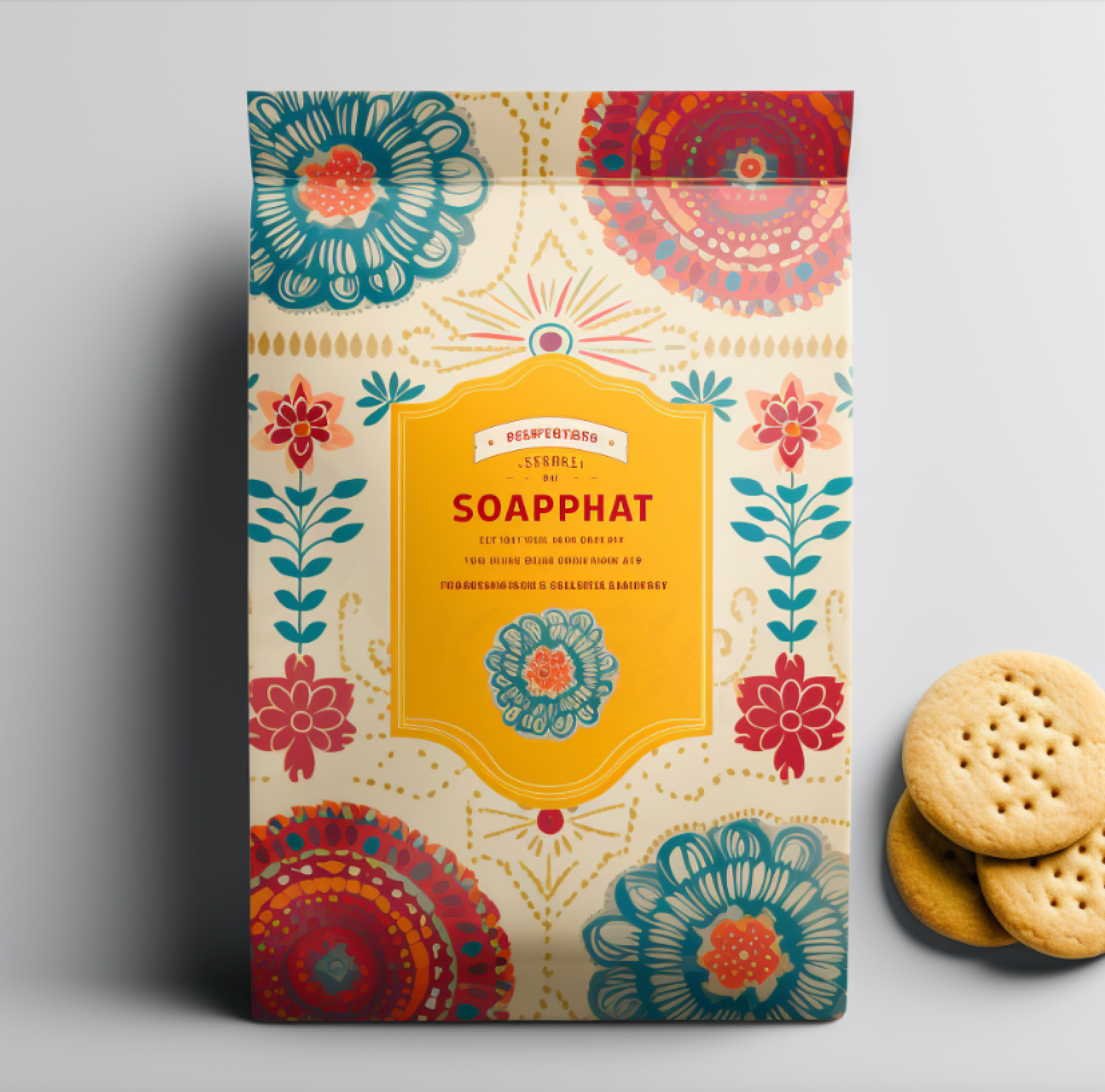
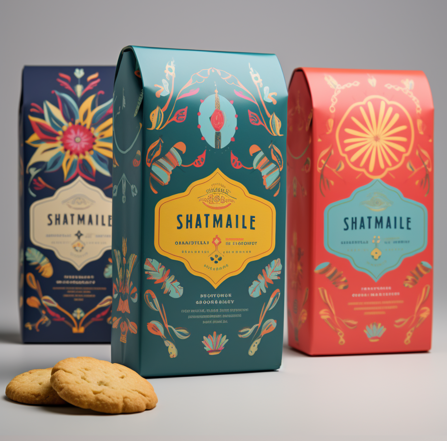
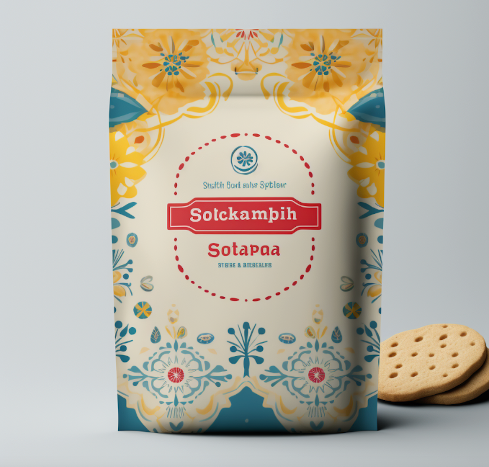
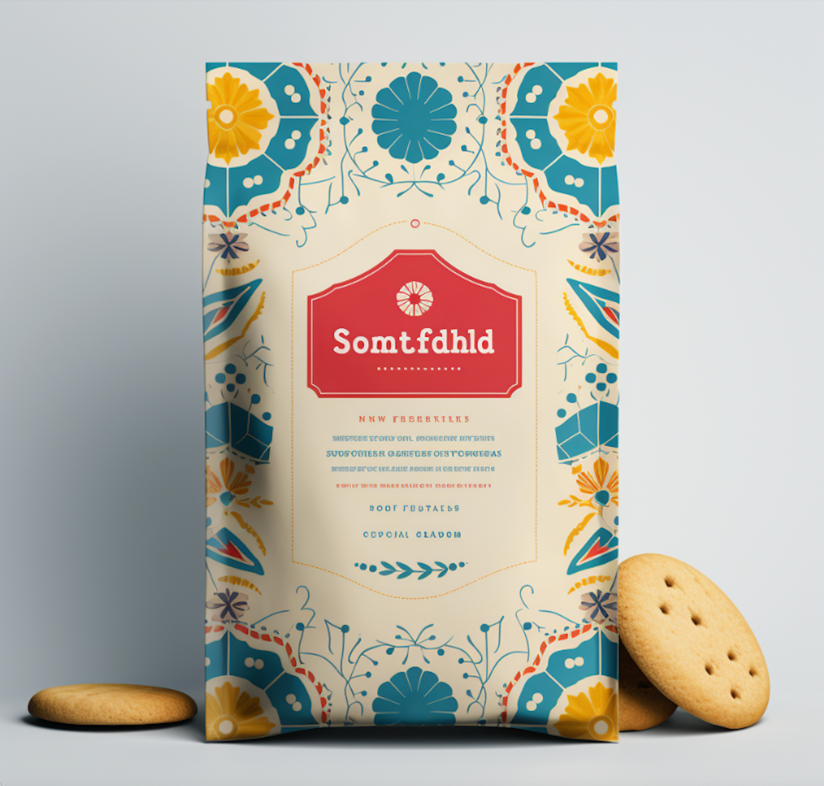
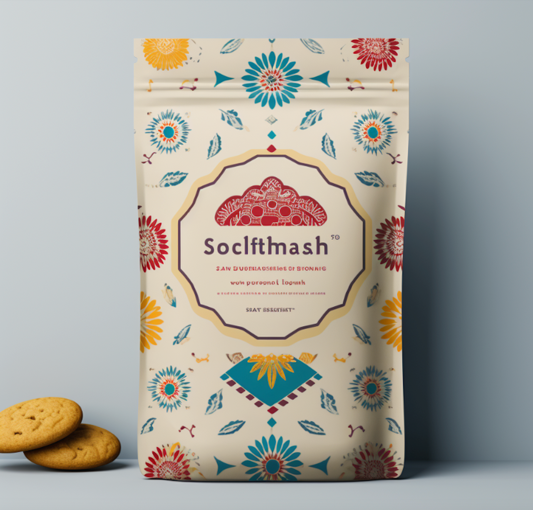
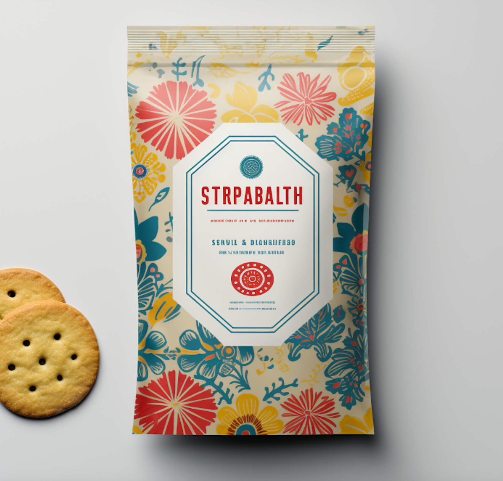
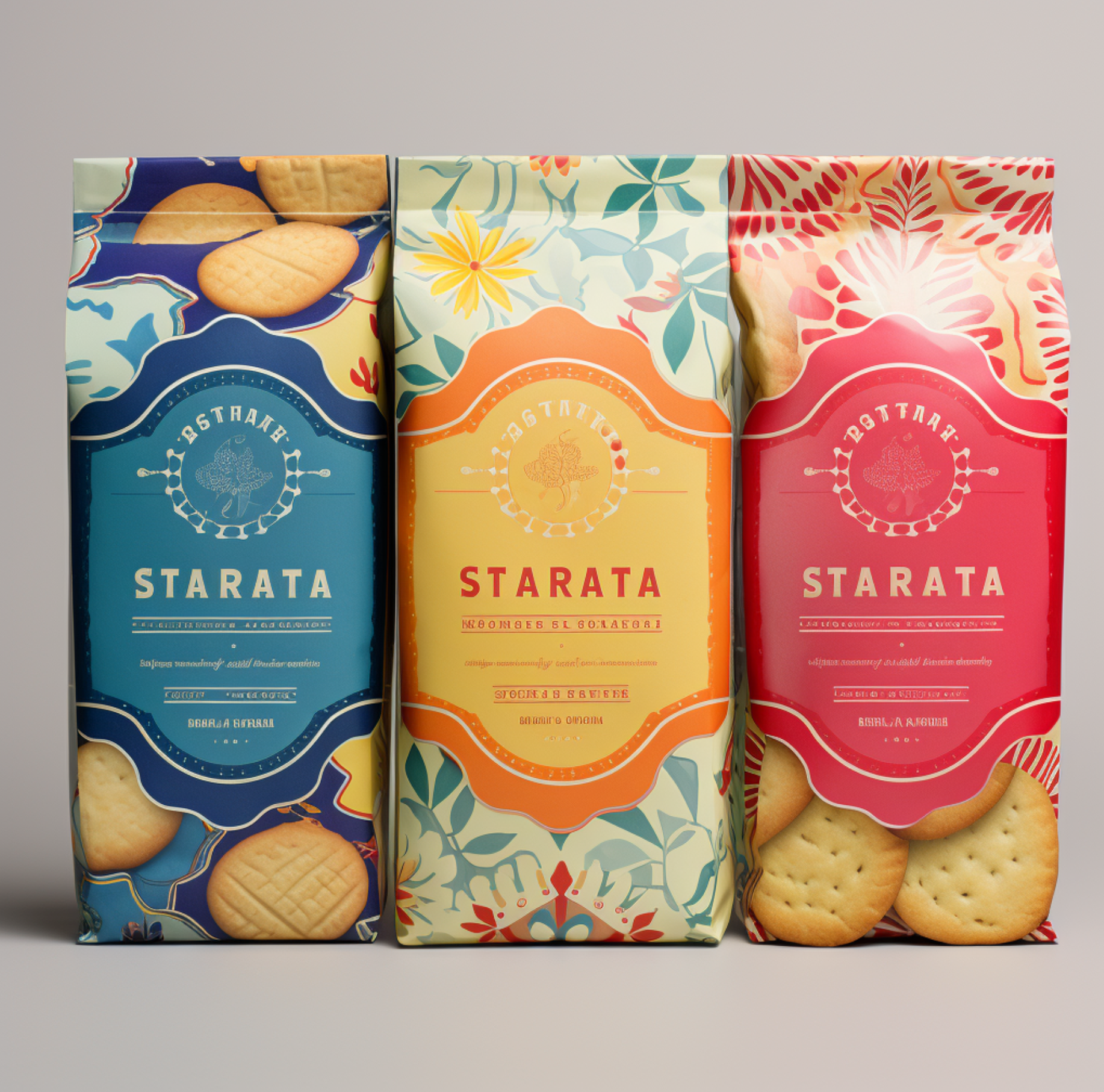
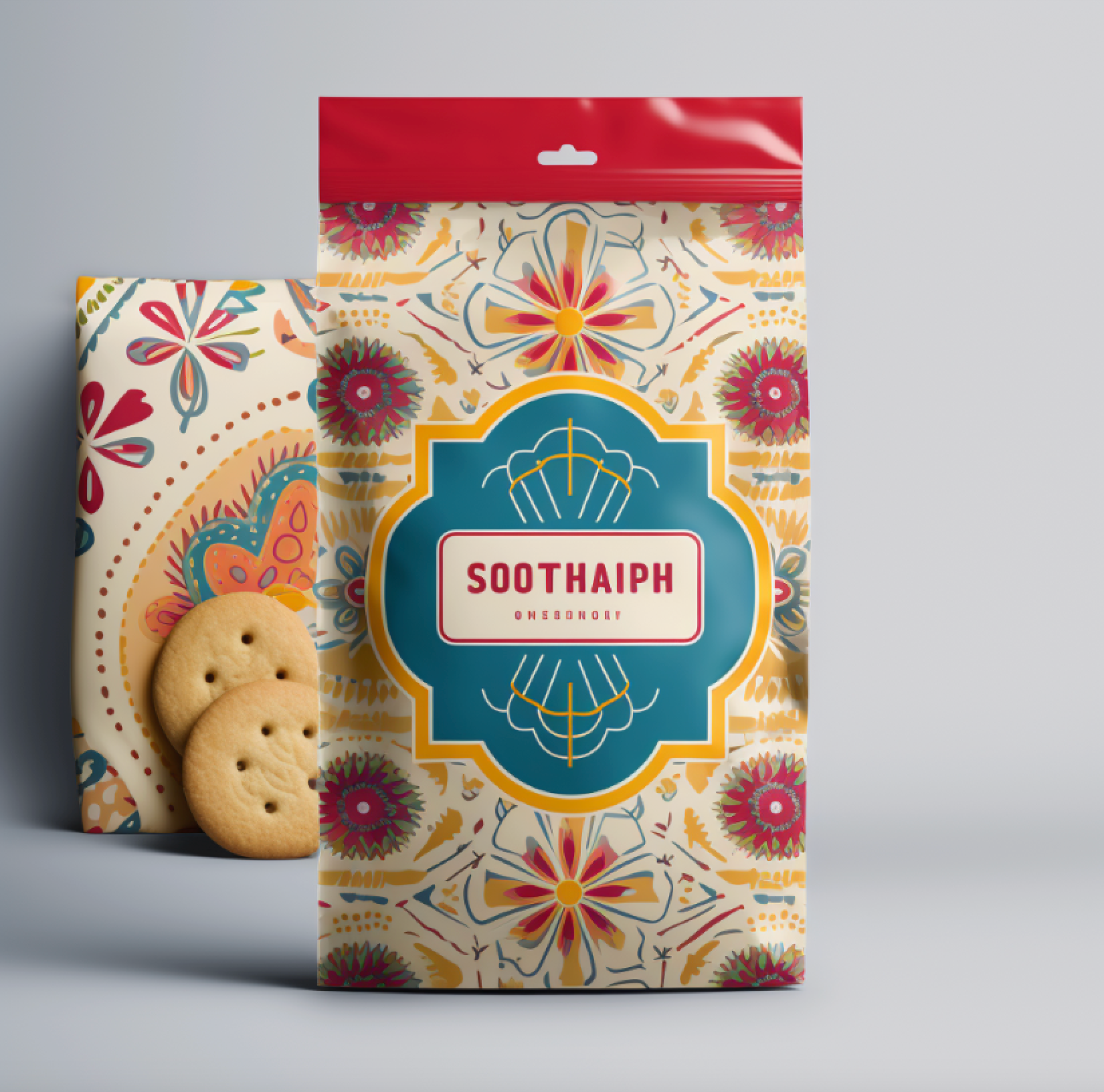
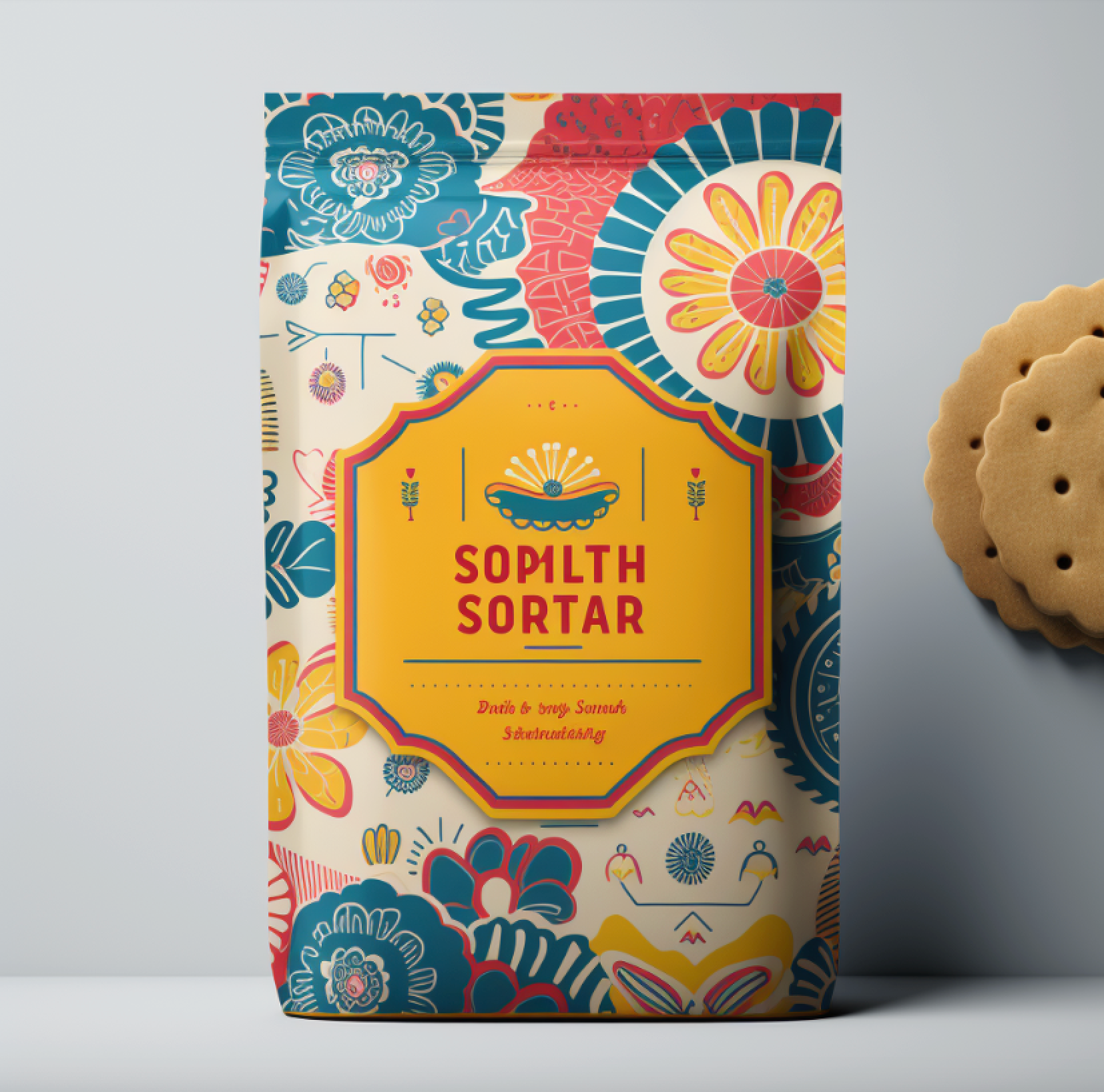
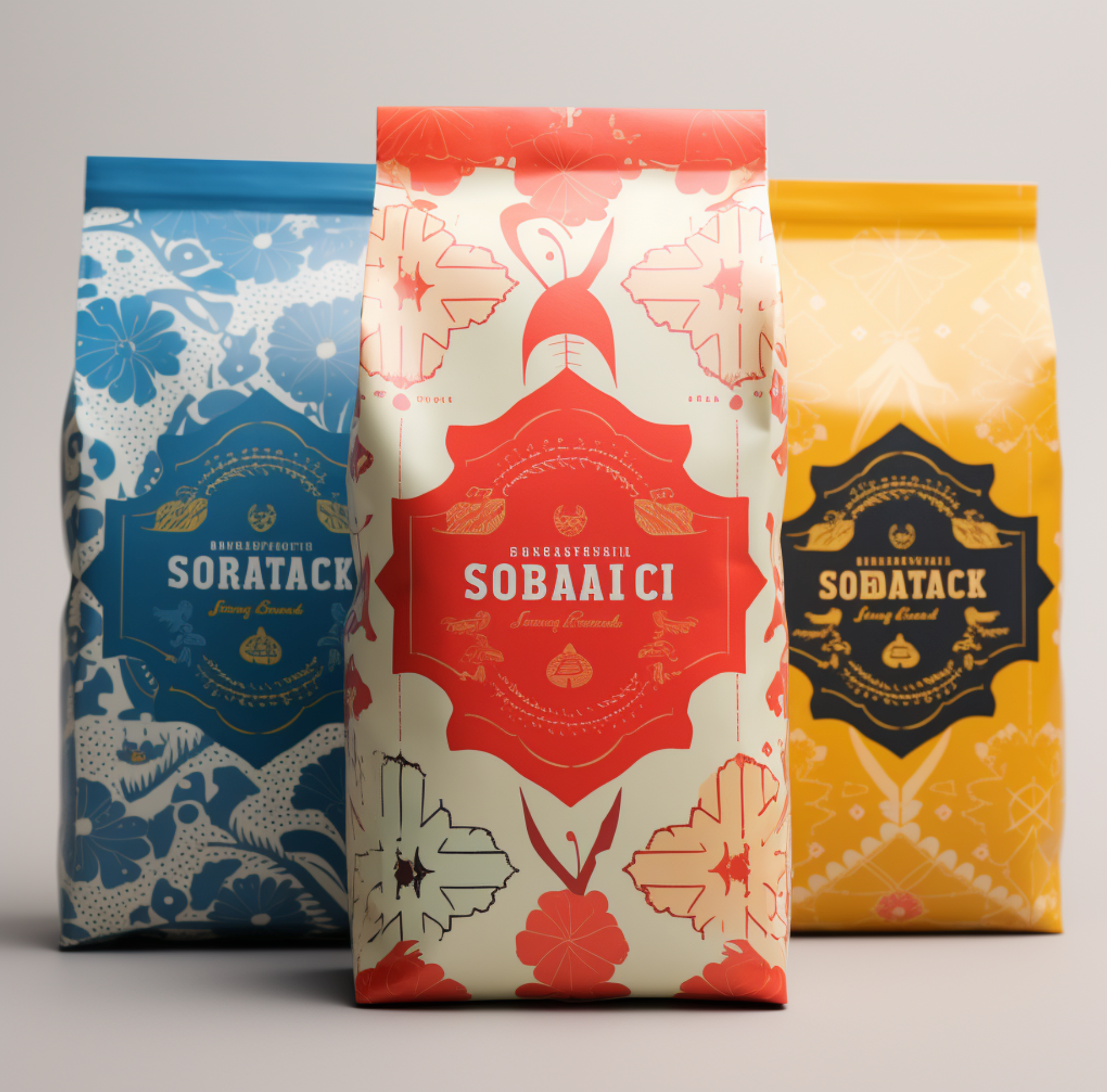
A package design infused with delightful fun, using colours that pop, maintaining a warm vintage vibe with inviting shapes and patterns that might have been found on grandma’s country tablecloth. These distinctive design options will stand out on the shelf, with happy pastime hues of yellow, red and blue.
Concept Development
Concept Development
I used Midjourney, prompting the first concepts to my specifications and provided feedback to iterate until it gave me the right balance of colour and style of pattern that perfectly aligned with my vision. The resulting concepts seen here are ready for client review.
This work gets us very close to a final concept which can be worked up in illustrator adding the logo and copy.
Created with MidJourney V5.2
Created with MidJourney V5.2