Fifth Story – Brand Strategy and Brand Identity Guides
The Challenge
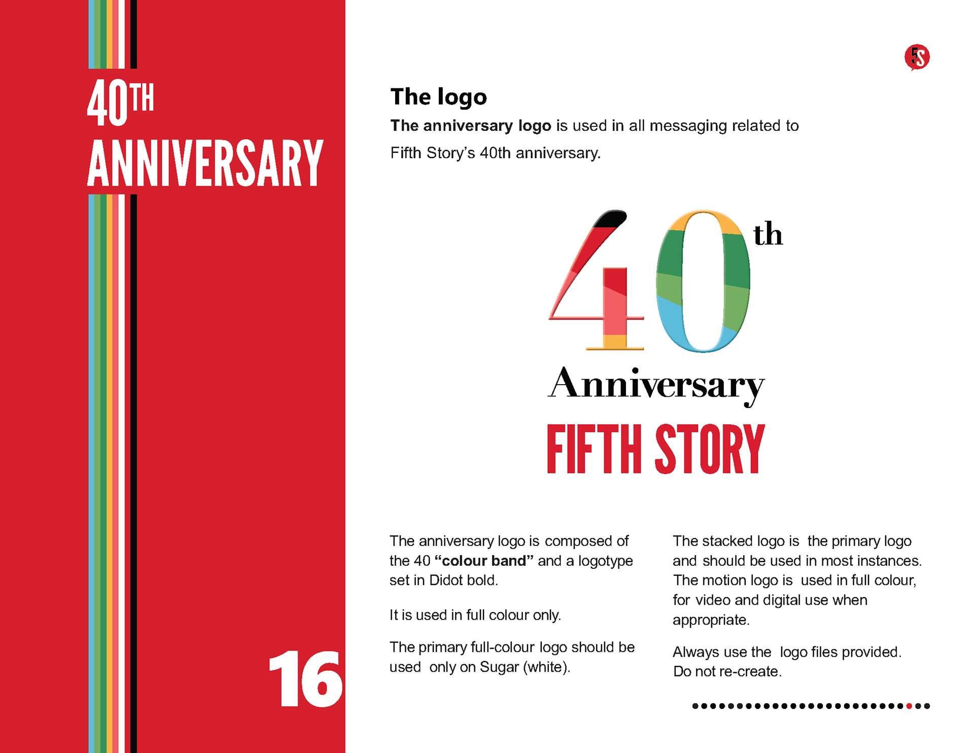
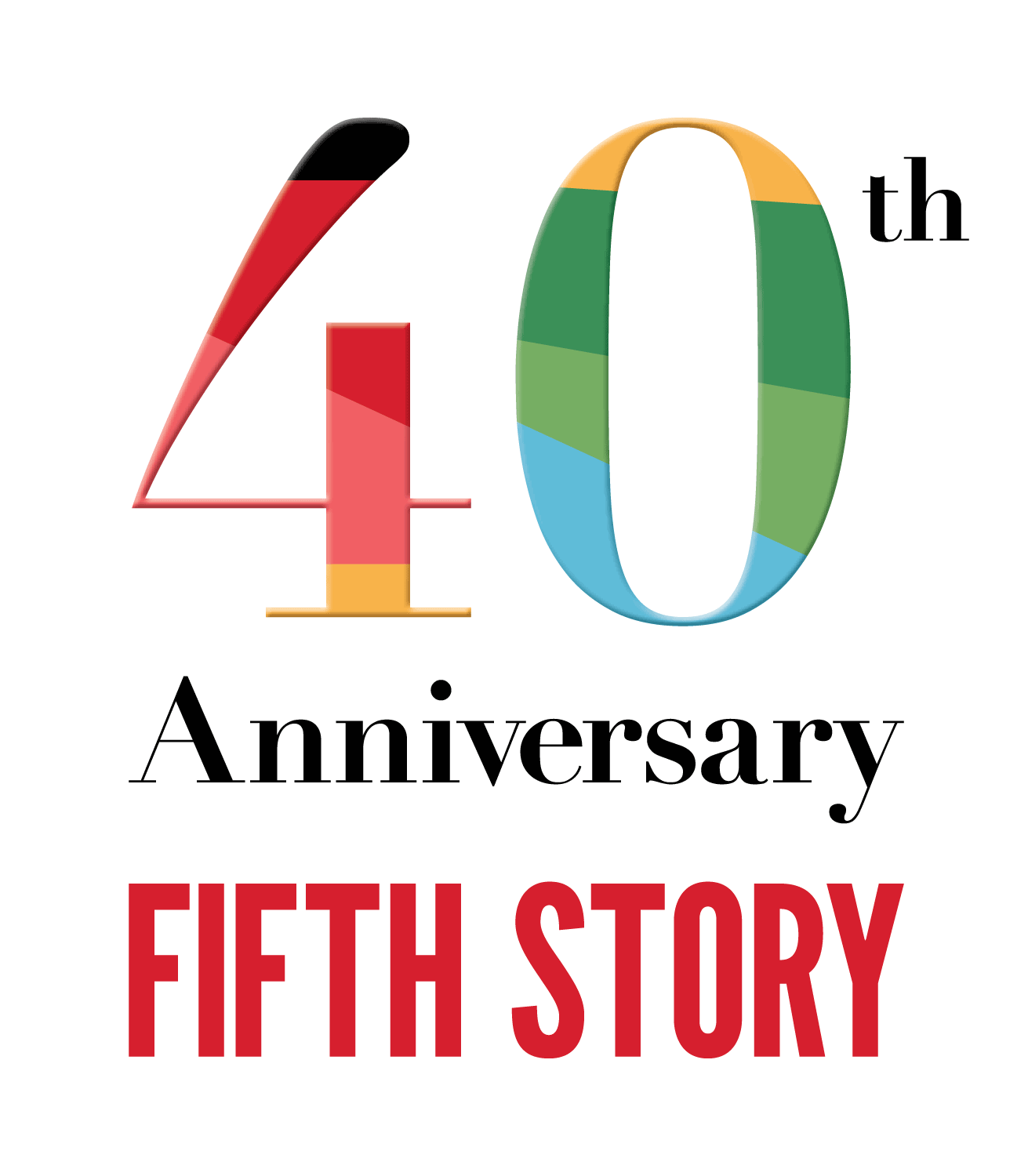
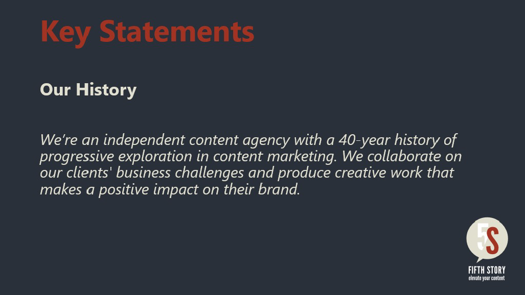
In an evolving industry, Fifth Story wanted to create an impact, keep pace with competitors and remain relevant in the content marketing space. With a 40-year anniversary approaching it was time to reposition the Fifth Story brand. The rebrand required a brand strategy and visual identity with a refreshed logo and special attention to marking the occasion of their 40th anniversary.
The Solution
The Solution
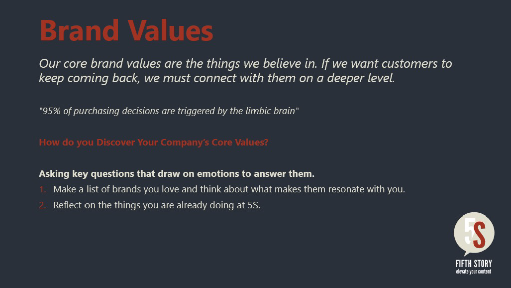
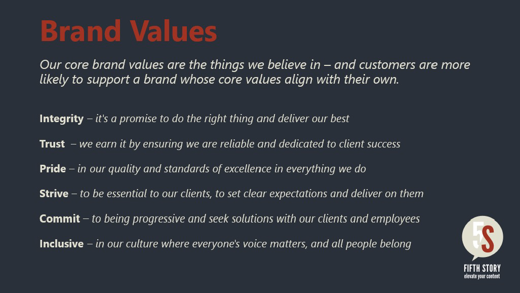
Brand Strategy
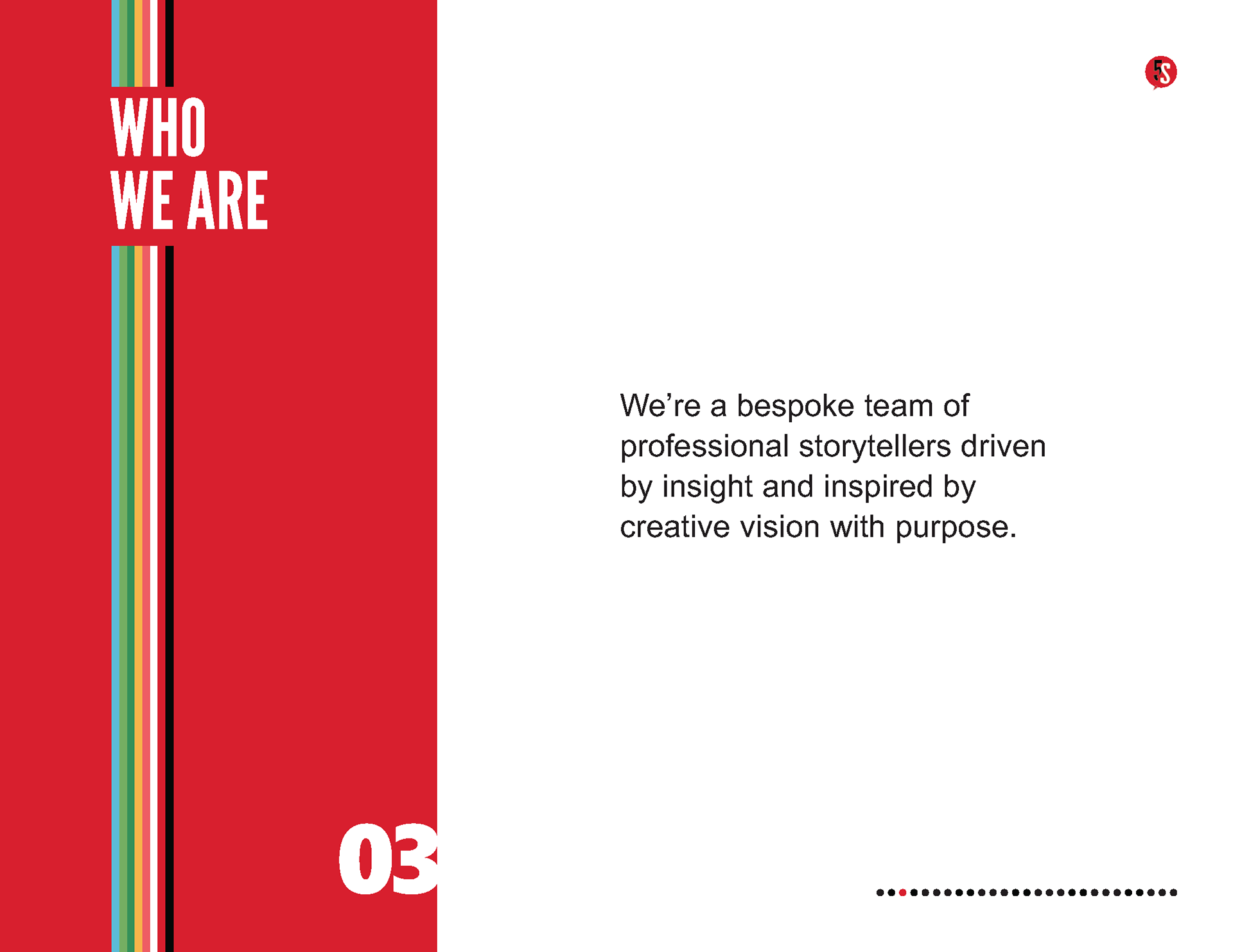
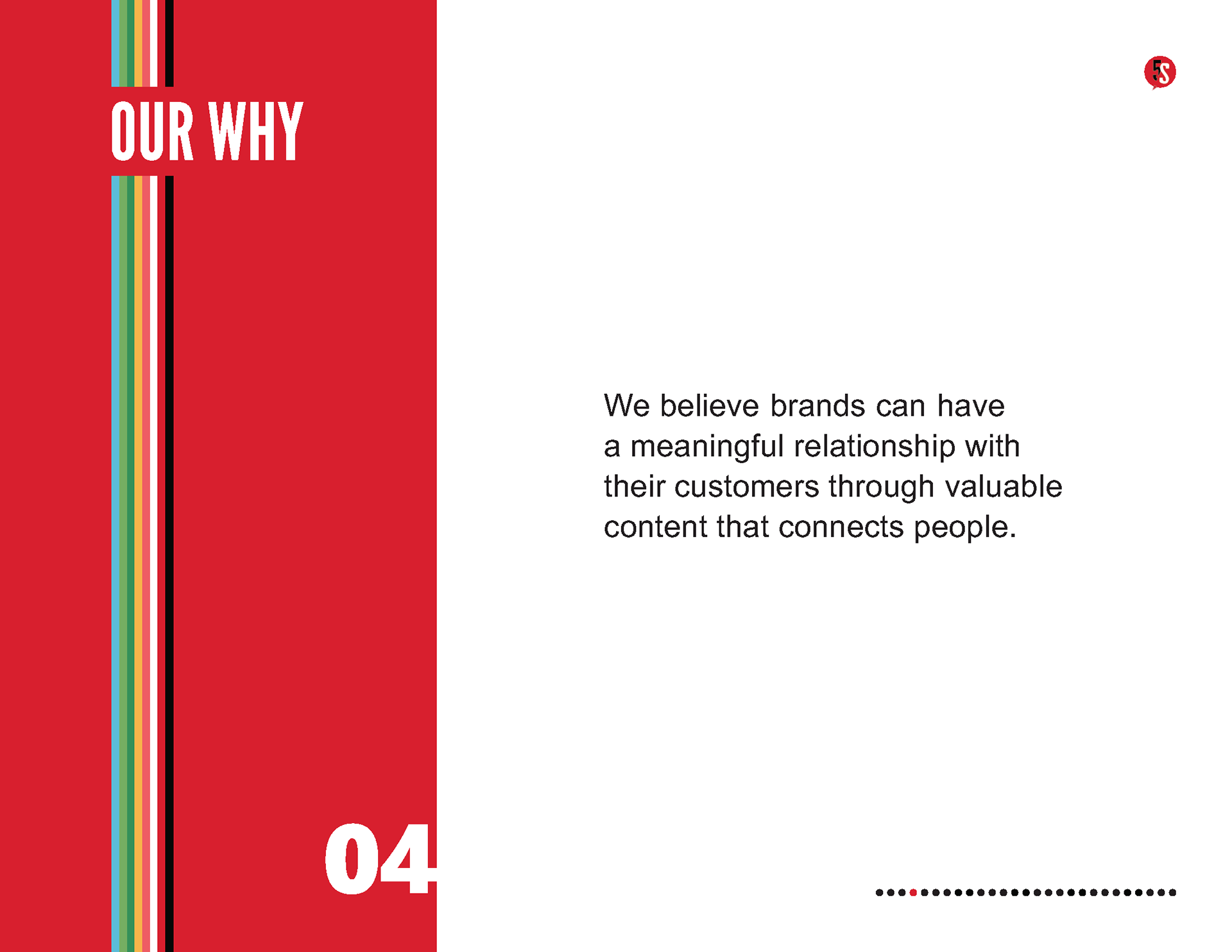
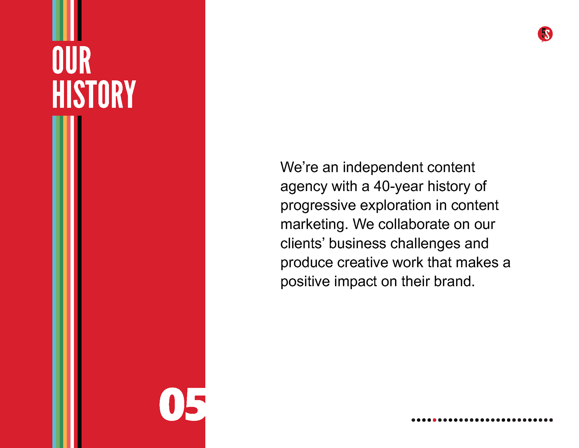
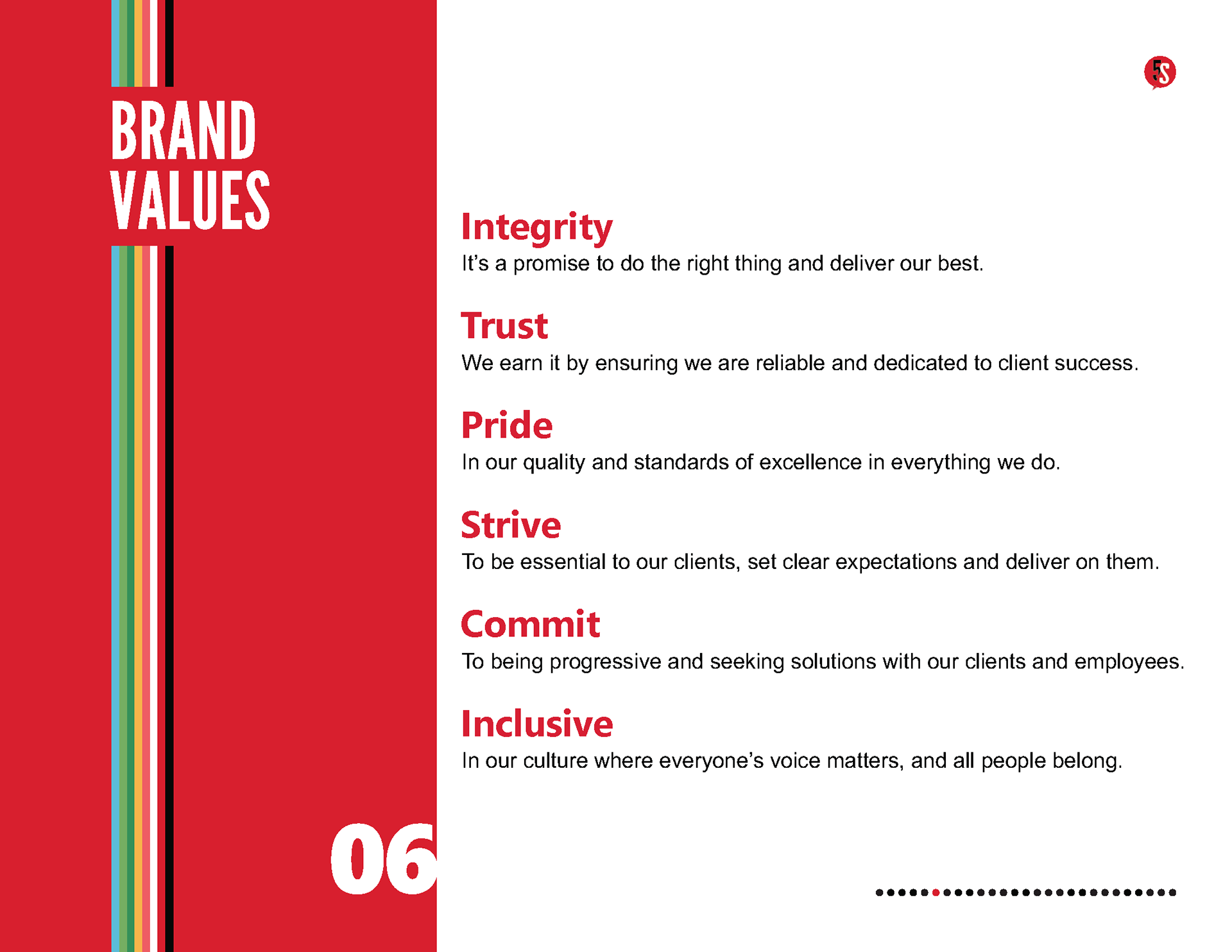
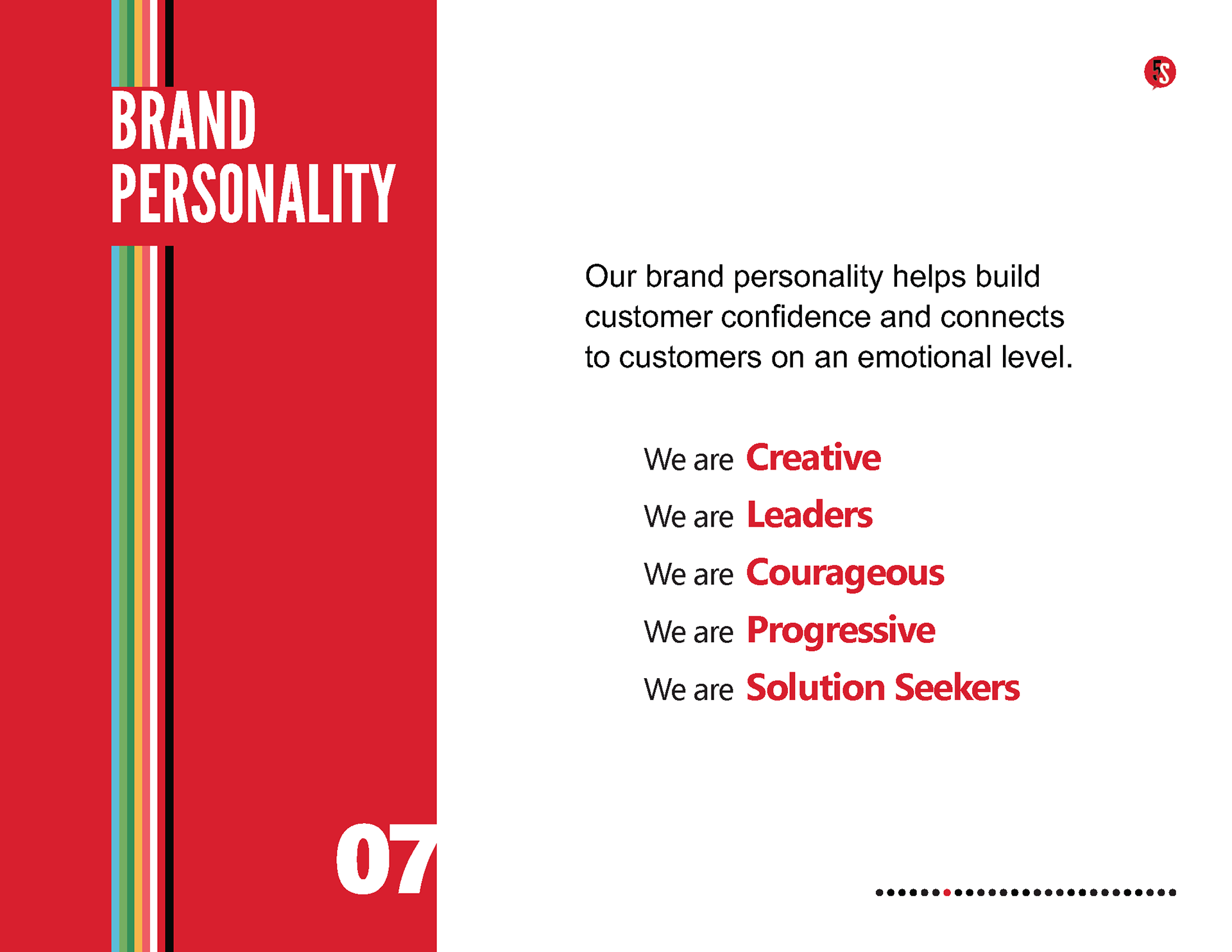
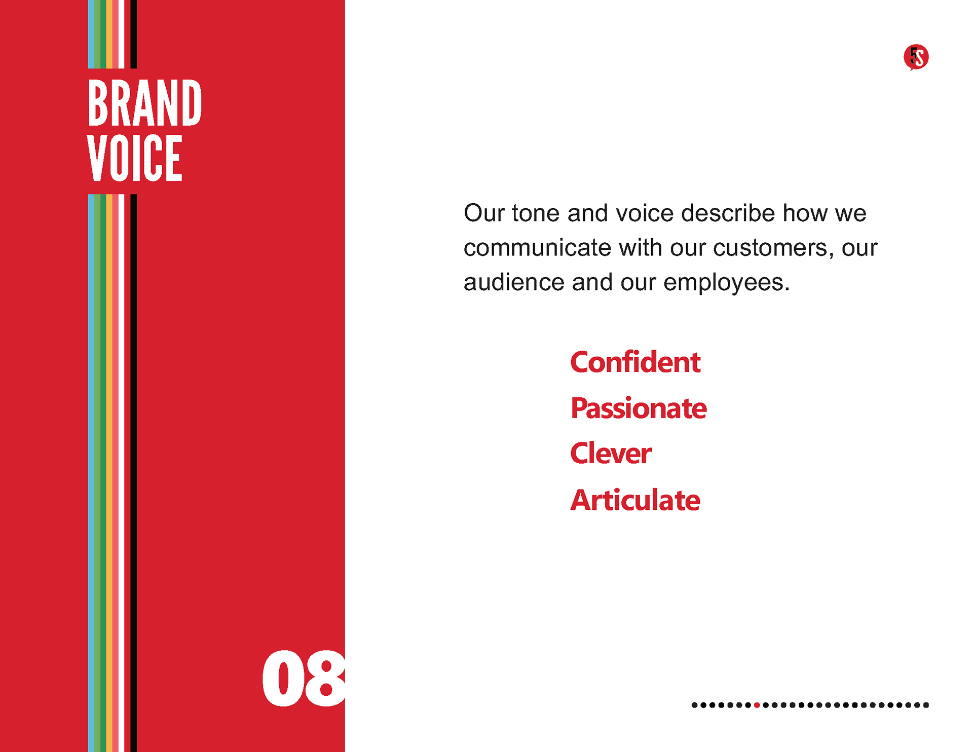
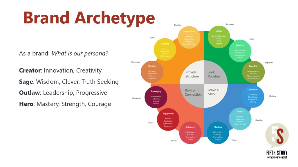
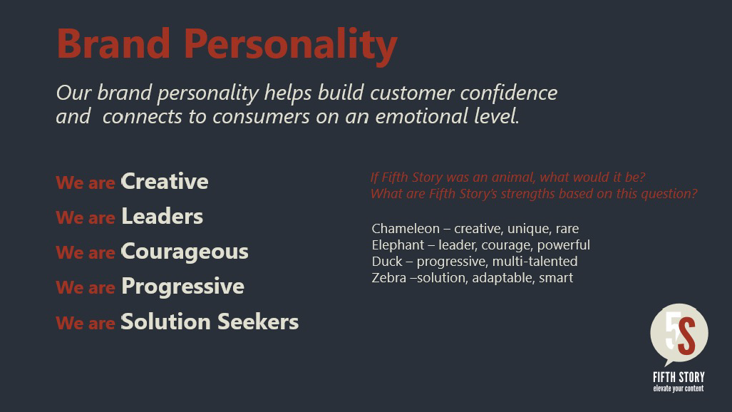
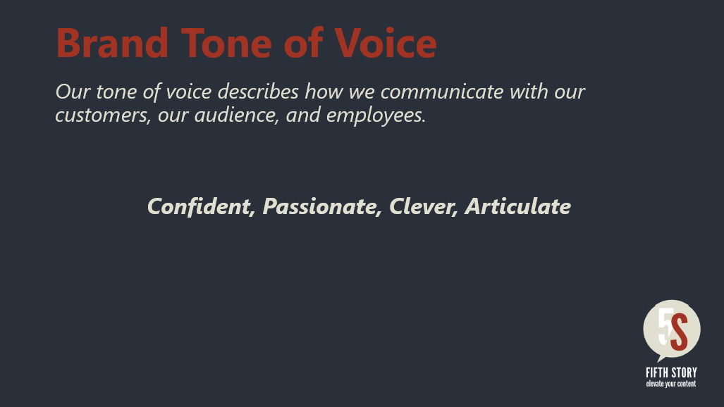
I led a brand strategy with internal leaders to uncover their unique offer and attributes, exploring the essence of what they stand for as a business and as a company culture. With research, we uncovered current perceptions from key stakeholders including leadership, employees and customers. The strategy work helped define brand positioning on voice, values, archetype, personality and competitive advantage.
I led a brand strategy with internal leaders to uncover their unique offer and attributes, exploring the essence of what they stand for as a business and as a company culture. With research, we uncovered current perceptions from key stakeholders including leadership, employees and customers. The strategy work helped define brand positioning on voice, values, archetype, personality and competitive advantage.
Brand Identity
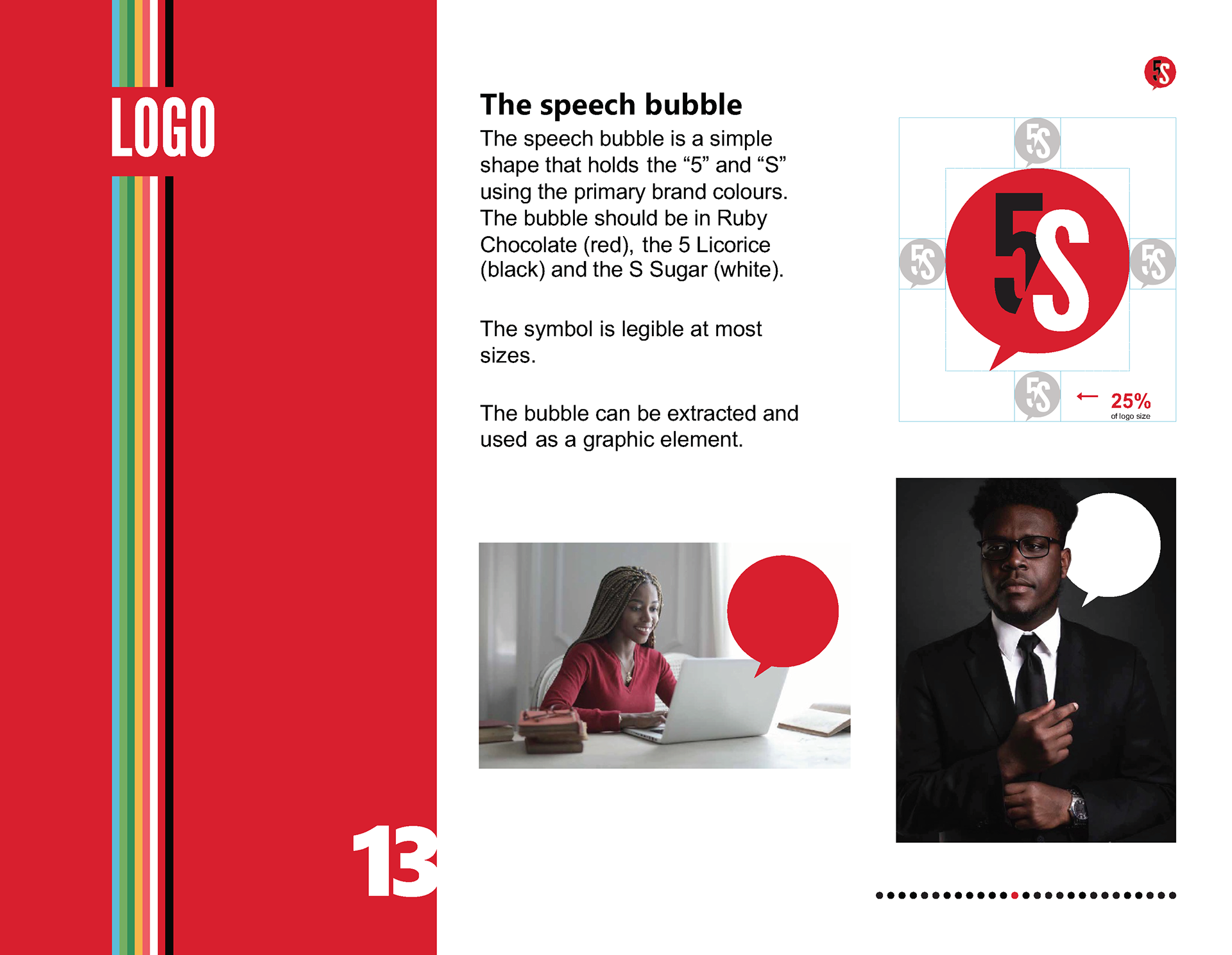
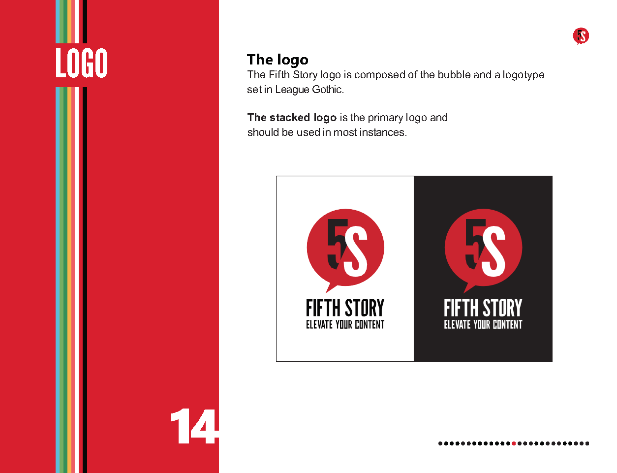
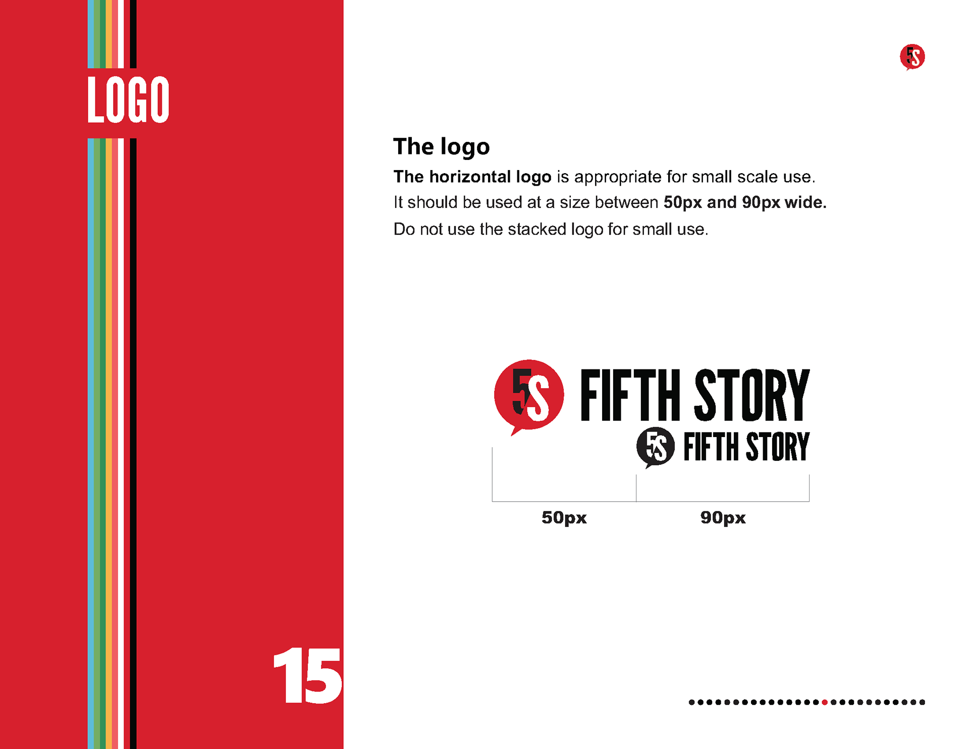
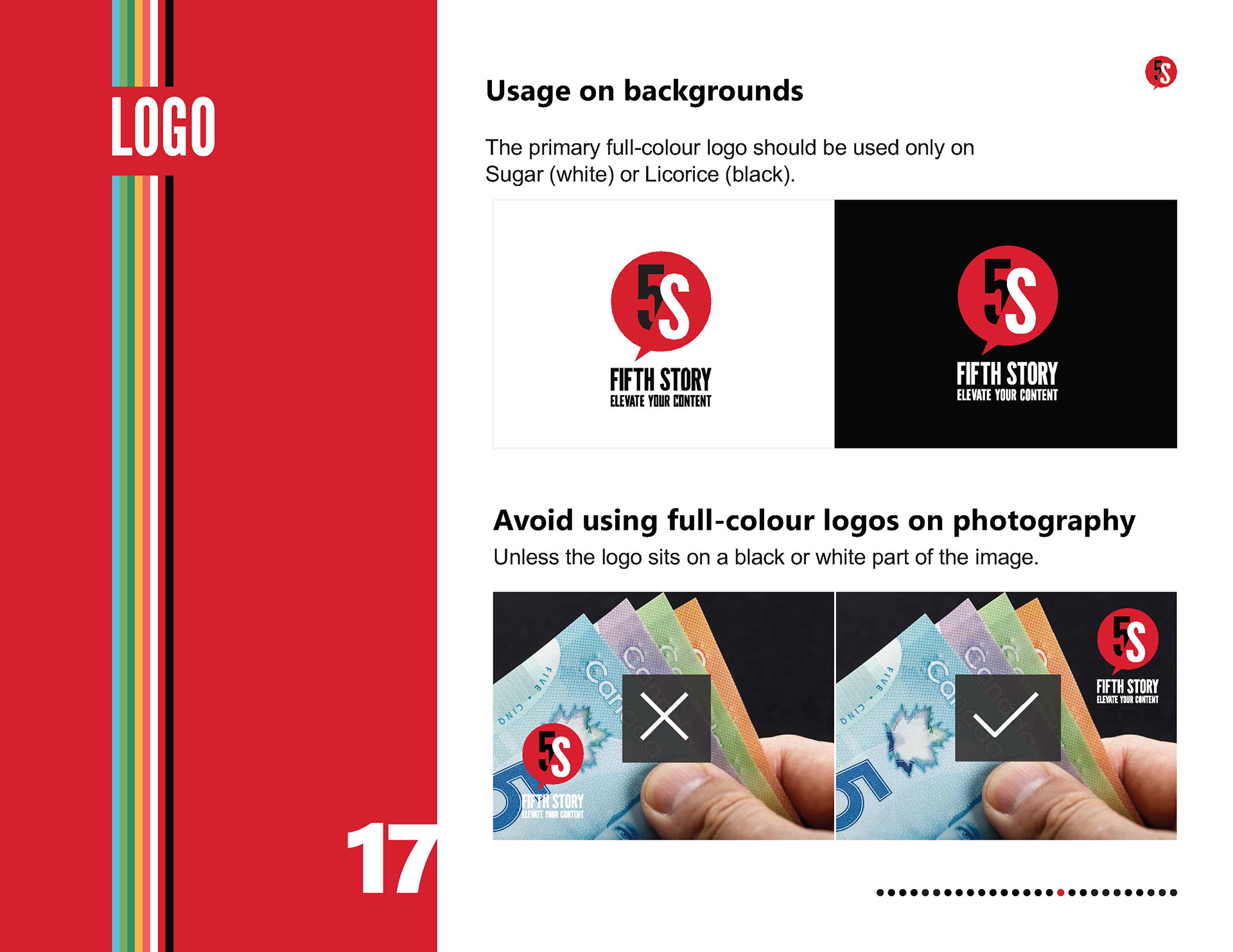
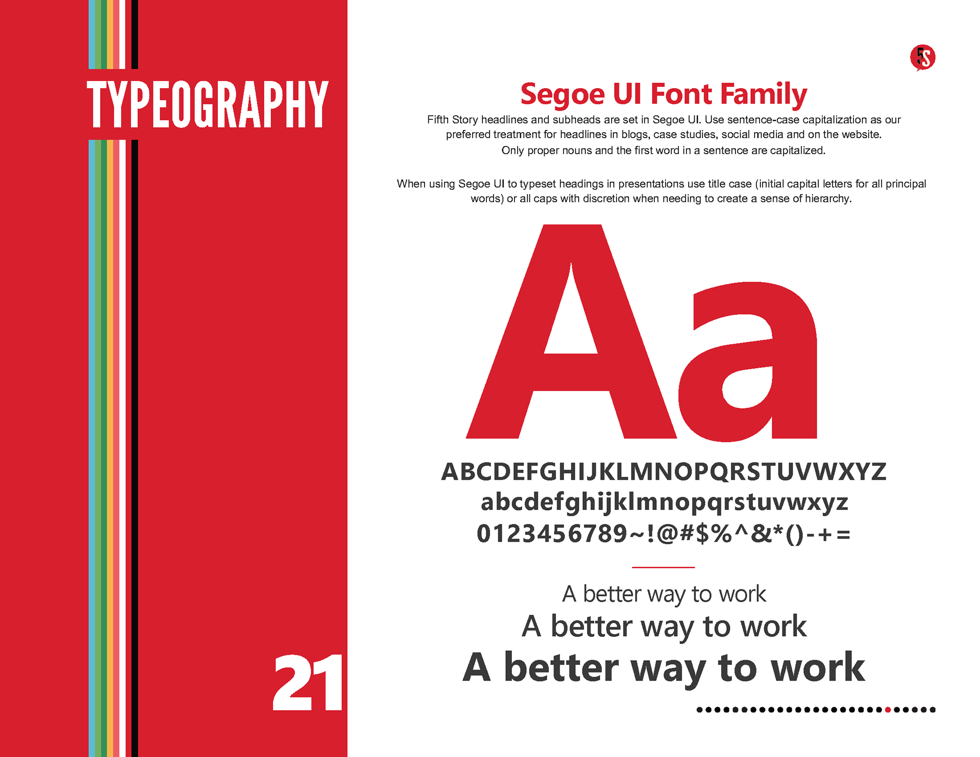
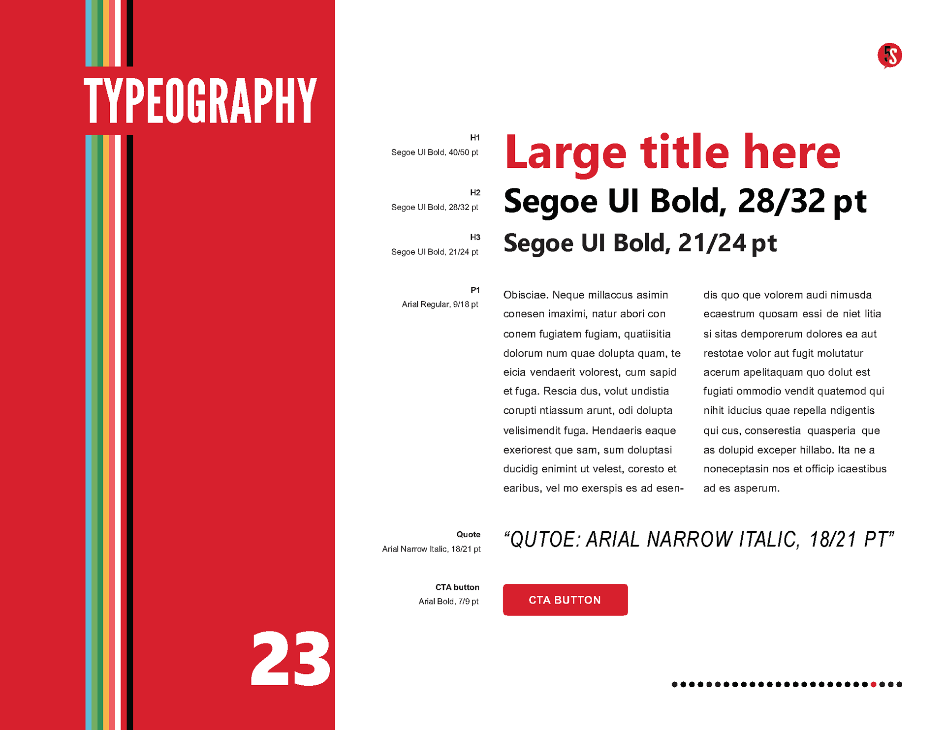
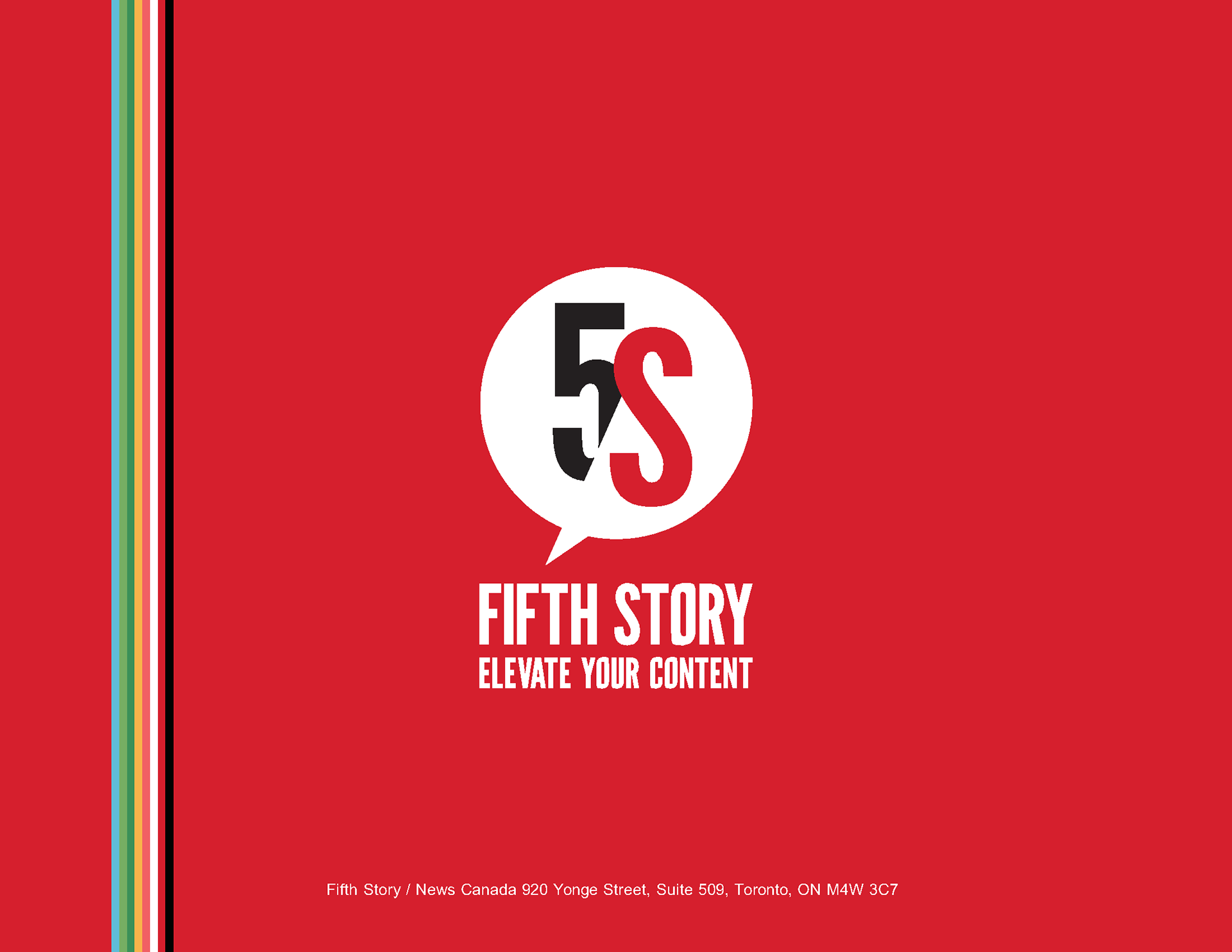
Fifth Story’s brand identity was rooted in a vibrant modern design that exuded the brand's personality. Building blocks were developed with decisions on colour palette, typography and shapes. Fifth Story’s logo was refreshed with a bright ruby red colour that made a bold statement and created renewed excitement for the brand. I designed a vibrant multi-colour anniversary logo as a focal point for a digital campaign celebration. With a digital first focus, web safe fonts were chosen to deliver a bold typography treatment that featured well on presentations, web, digital and social. Designed in harmony these elements were used to create assets that communicated with customers across multiple touchpoints.
Fifth Story’s brand identity was rooted in a vibrant modern design that exuded the brand's personality. Building blocks were developed with decisions on colour palette, typography and shapes. Fifth Story’s logo was refreshed with a bright ruby red colour that made a bold statement and created renewed excitement for the brand. I designed a vibrant multi-colour anniversary logo as a focal point for a digital campaign celebration. With a digital first focus, web safe fonts were chosen to deliver a bold typography treatment that featured well on presentations, web, digital and social. Designed in harmony these elements were used to create assets that communicated with customers across multiple touchpoints.
Brand Strategy
I presented the strategy internally to the organization during a Town Hall meeting as much as a temperature check as to gain buy-in and encourage collaboration, it was well received creating excitement for the brand identity reveal.

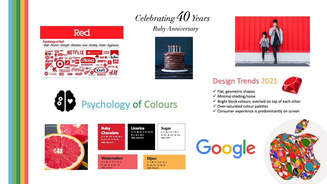
Mood board
A mood board was created to capture elements of the new look and feel featuring a ruby red colour for the logo that complimented Fifth Story’s brand personality of passionate leaders and played nicely into their upcoming (40th) ruby anniversary. Current design trends were incorporated into the brand identity such as the use of bright colours, flat geometric shapes, and bold typography that all worked together to ensure a modern brand refresh.
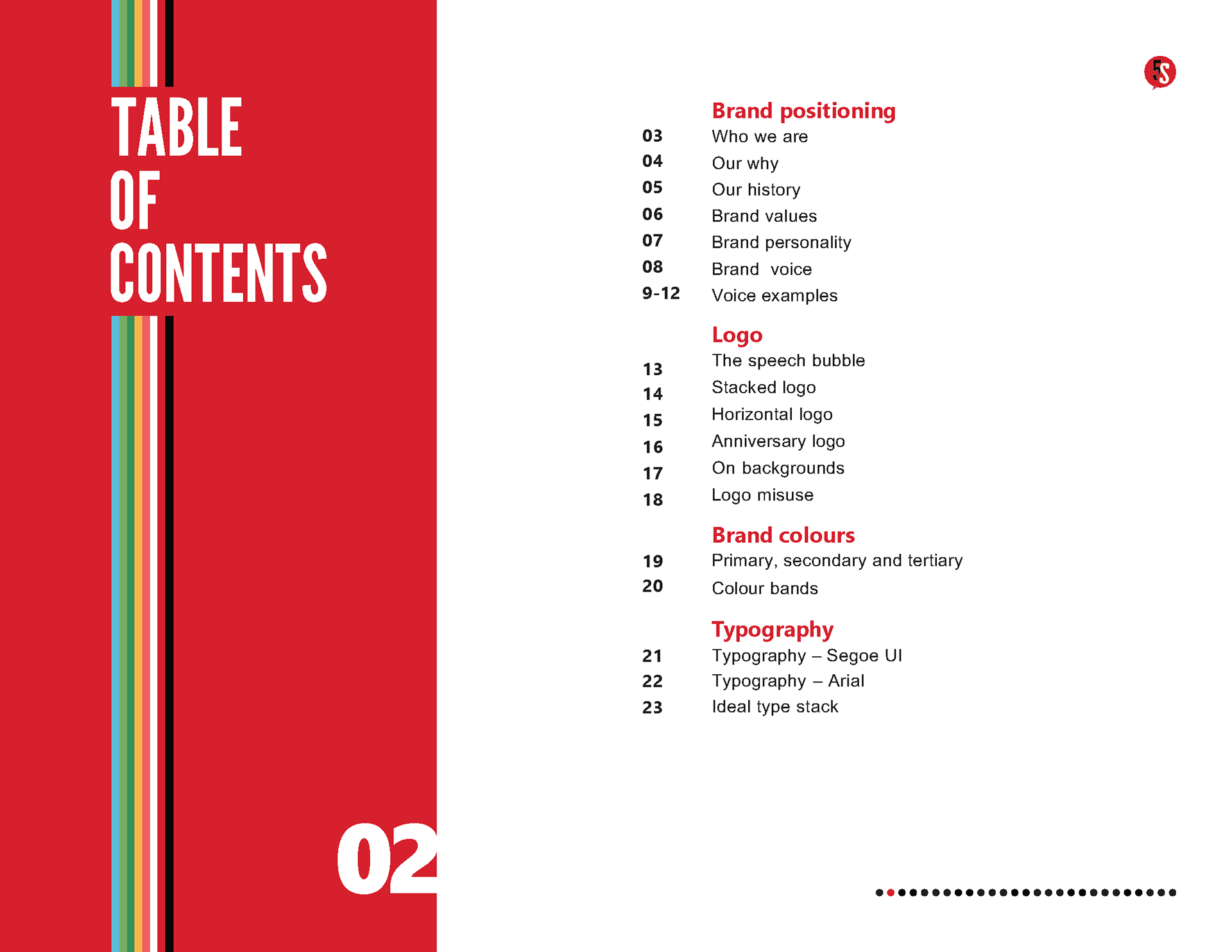
Brand Identity Guidelines - see the complete guide